Barclays.co.uk
Redesigning one of the UK's most visited financial websites — 130M+ annual visits, a Design Language adopted across three banking sites, and navigation success up from 52% to 72%.
- Role
- Lead UX Designer across design language, IA, research, component design and workshop facilitation — and joint Lead UX and project manager (PRINCE2) for the financial tools programme
- Team
- Cross-functional team of 10 — design, engineering, content, plus senior stakeholders across the digital estate
- Scope
- End-to-end responsive redesign of barclays.co.uk — 300+ pages, design language, IA and a bespoke financial tools suite
The stakes
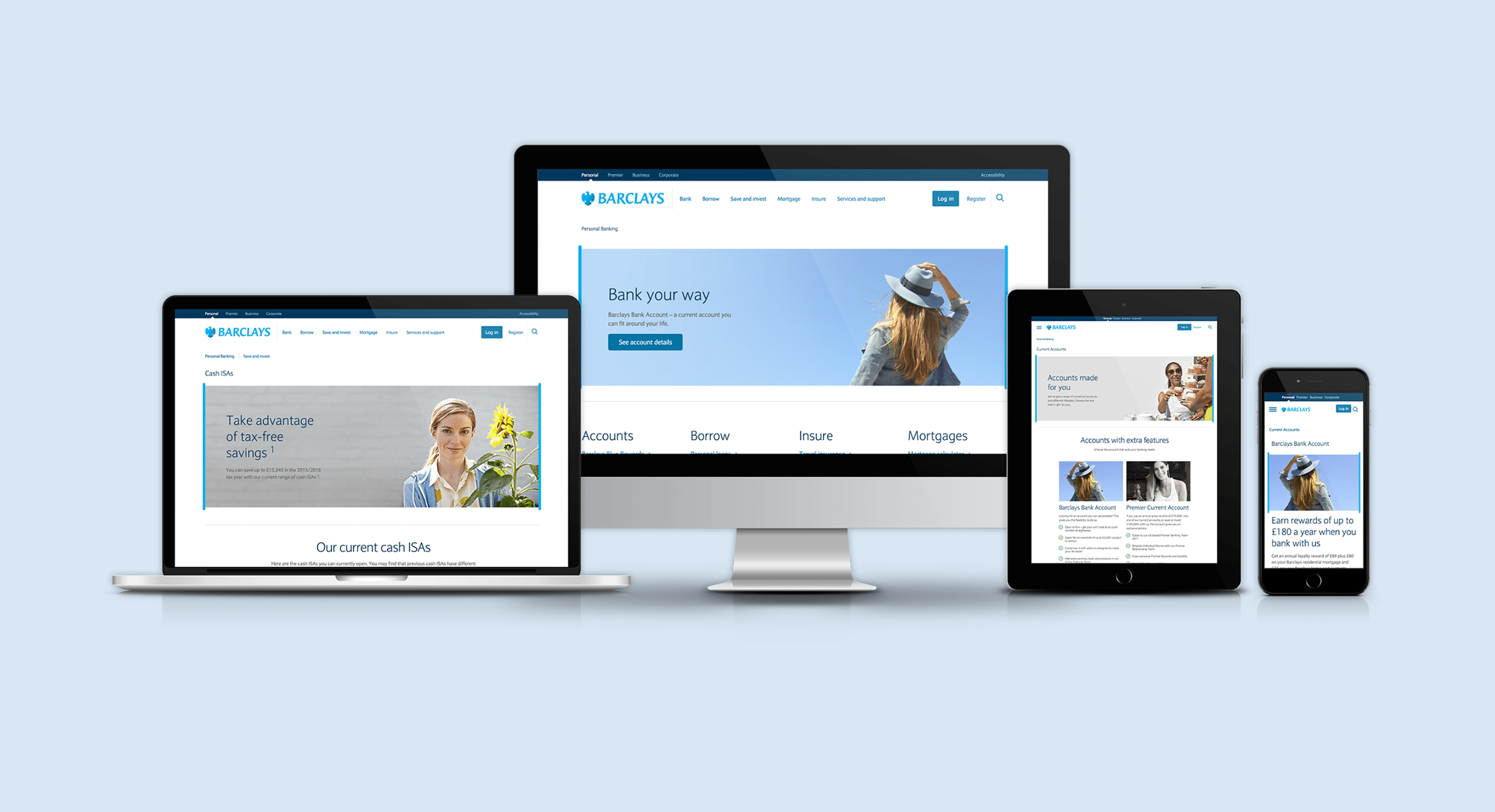
Barclays.co.uk is the front door to one of the UK's biggest banks — 130M+ visits a year. The site had grown to 300+ pages with no consistent UI kit, a tangled information architecture, and a design that met neither modern user expectations nor accessibility standards. Every page was bespoke; every change was slow.
The brief was a complete responsive redesign, retiring the separate mobile site and unifying everything into one experience. But the real problem was structural: without a shared design language, the organisation couldn't ship consistently at scale. So I framed the project as two products — the website customers would see, and the system the bank would build with afterwards.
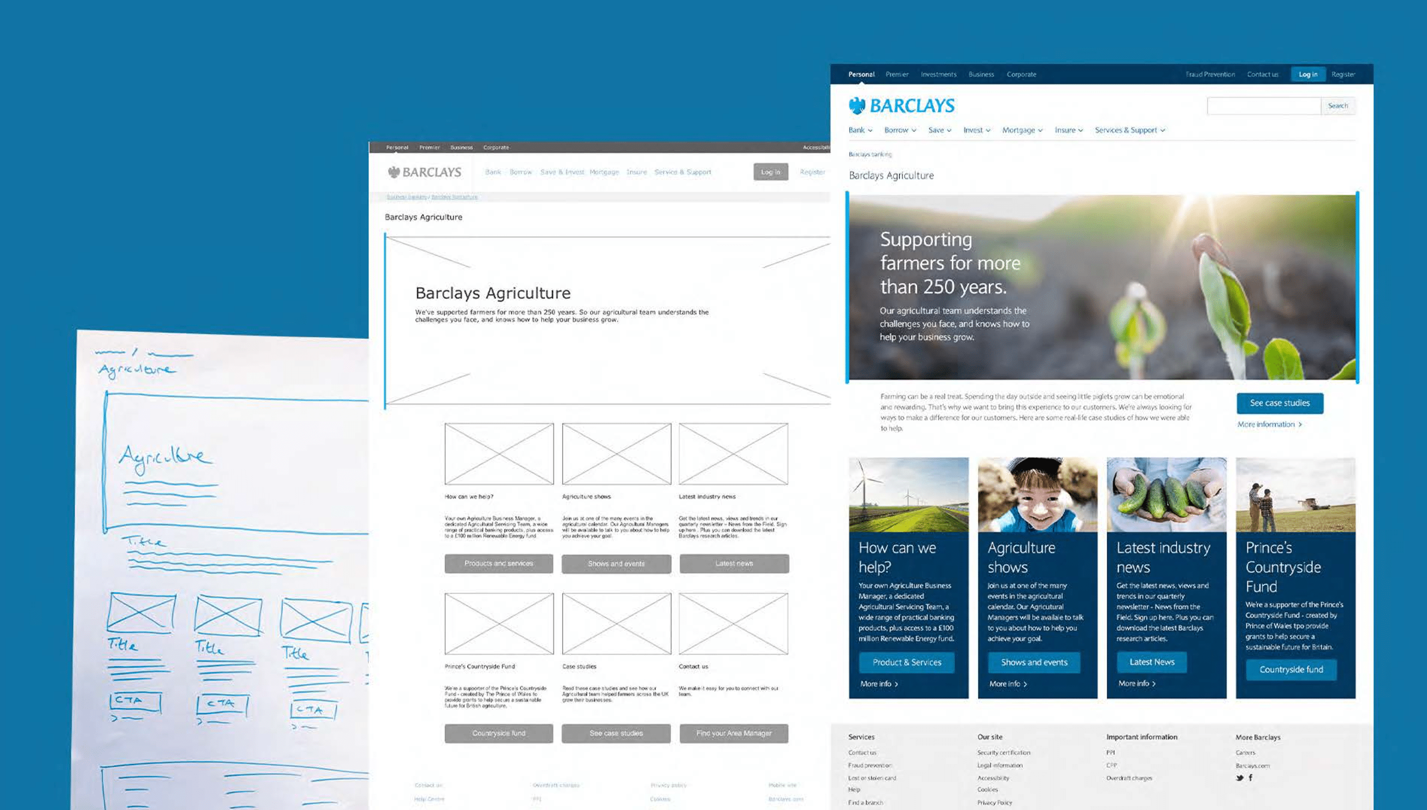
A system before a website
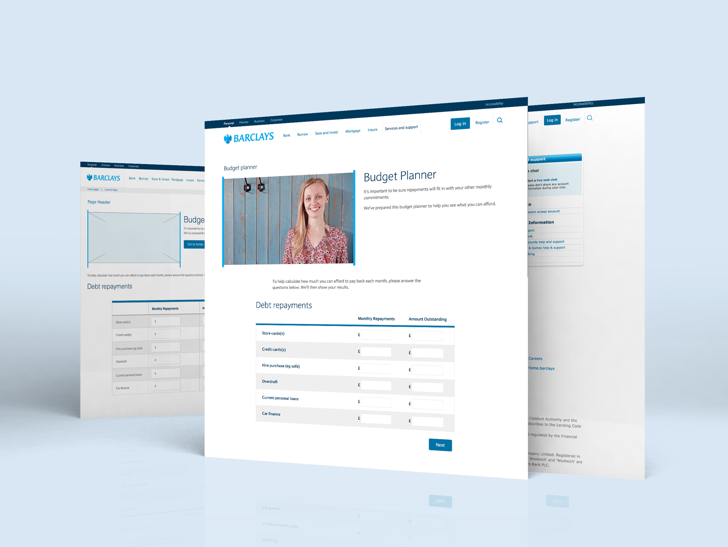
I audited the entire site to surface its repeating design patterns, then designed responsive components iterated through multiple rounds of in-house customer testing. This became the Barclays Design Language — built to serve not just .co.uk but Premier Banking and Business Banking too, giving the entire digital estate a shared vocabulary for the first time.
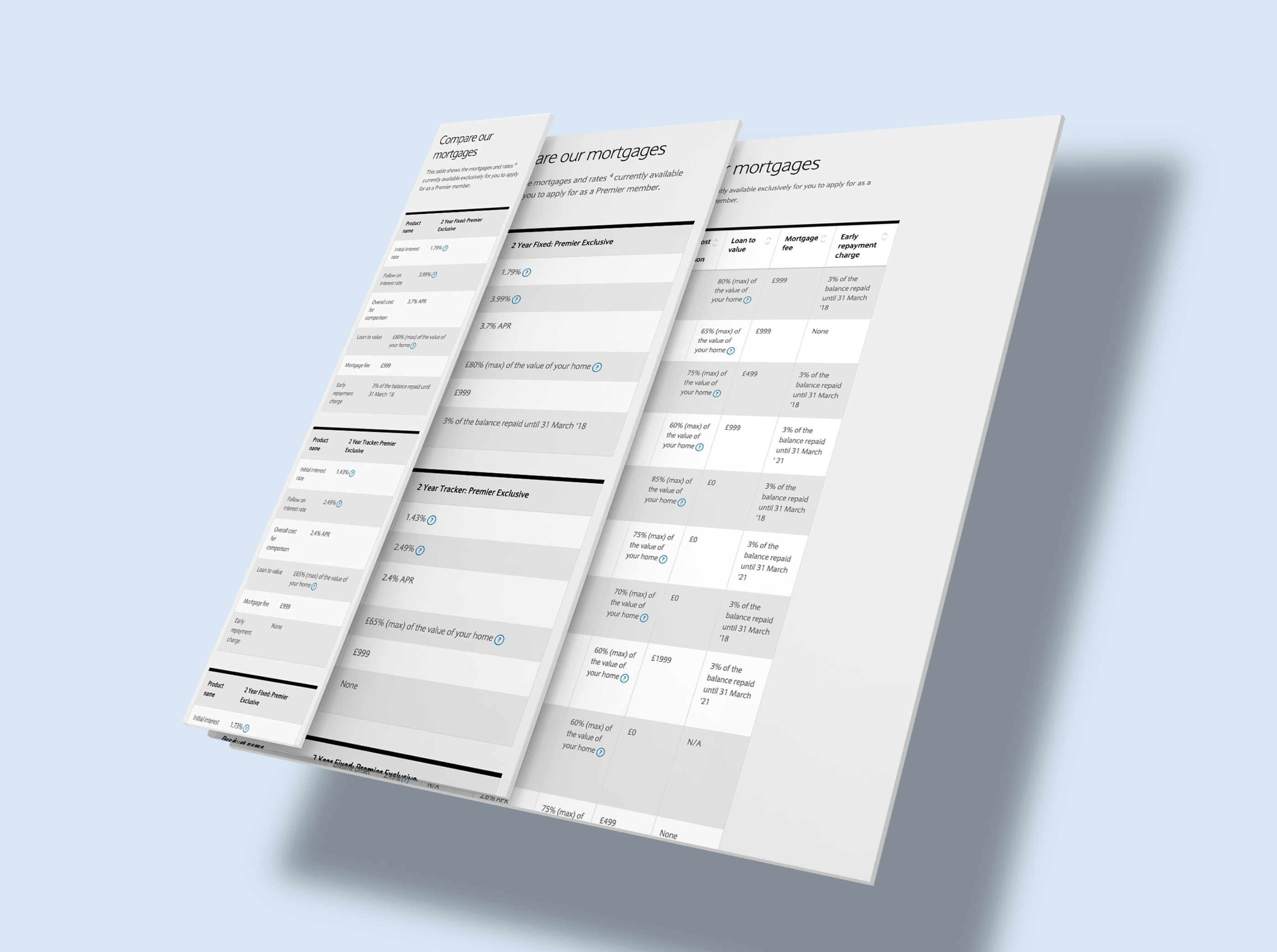
The hardest component was the humble table. Financial content is dense with comparison tables, and they fail badly on small screens. Horizontal scrolling didn't work — people lost track of what they were comparing. I reflowed rows into stacked, scannable cards for mobile, validated with testing, and it became the standard pattern across the estate.
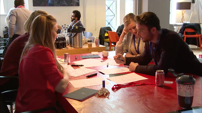
Scaling design through workshops
300 pages can't be designed one at a time by one team. With the component set as a shared vocabulary, I ran wireframe workshops with stakeholders across the business — building page structures together rather than presenting finished designs for sign-off. Stakeholders who help assemble a page don't ask for revisions later.
New designs were tested weekly in our in-house usability facility, refined, then released to development. Evidence kept opinions honest — including mine.
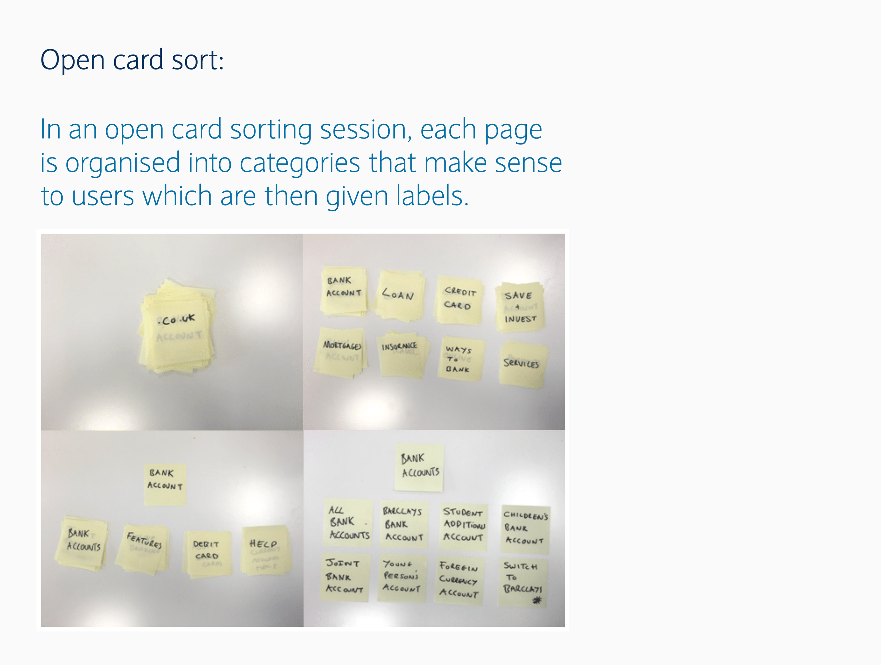
Information architecture, proven with data
The existing IA had grown into something only employees understood. I restructured it around discoverability using card sorting with customers, then verified the new structure with online tree tests before a single page was built.
12 navigation tasks, two architectures. The results made the case unarguable:
Success rate:
52% → 72%
Directness:
78% → 90% — users took the right path first time
Time taken:
7m 40s → 7m 8s
Leading delivery, not just design
Midway through the programme, a project manager's maternity leave left a gap on a parallel workstream: a bespoke financial tools suite. I took it on jointly — Lead UX Designer and project manager — earning a PRINCE2 certification and leading a cross-functional team of 10 to deliver 10+ components over six months, on time.
Owning the delivery plan, the dependencies and the budget changed how I scope design work permanently. I've never since designed something without knowing what it costs to build.
“He joined Barclays at a really critical time on a very high profile project, one that was struggling without the right UX support. Not only did Antony come in and completely lead the way for this project specifically, he went above and beyond to improve all activities, knowledge sharing and collaboration from around the entire business.”
Impact
Navigation success from 52% to 72%,
directness from 78% to 90%, task time down — proven by tree testing before a single page was built.
The Barclays Design Language adopted across three sites
barclays.co.uk, Premier Banking and Business Banking — cutting design and development time by 50%, and unifying desktop and mobile into one experience for the first time.
300+ pages redesigned
to WCAG standards, serving 130M+ annual visits — the Design Language outlasted the project and later became the foundation for the barclays.co.uk migration to Adobe Experience Manager.
Looking back
What I'd do differently: Bring engineering into the component design loop earlier. The Design Language halved delivery time once adopted, but the first components needed rework to match technical constraints. Designing the system with its builders, not for them, is now how I work by default.
Where it led: Barclays taught me that the highest-leverage design work is often the system underneath the screens. It's the playbook I took to Cisco — where the Sales Org UI Kit applied the same thinking to enterprise tooling at global scale.
“He joined Barclays at a really critical time on a very high profile project, one that was struggling without the right UX support. Not only did Antony come in and completely lead the way for this project specifically, he went above and beyond to improve all activities, knowledge sharing and collaboration from around the entire business at Barclays. No one else at this time was making these connections and bringing various internal teams and external agencies together.”
“He has taken the redesign of the website, listened to everyone's ideas, and with patience and skill introduced more resolved, customer-focused designs into the process. He has a calm manner and sensible approach that has created a collaborative environment in which the redesign project can discover a common view on the best experience for the user.”
“Antony is part of a leading edge of designers who are bridging the gap between the world of delivery and high-quality user-centred design.”