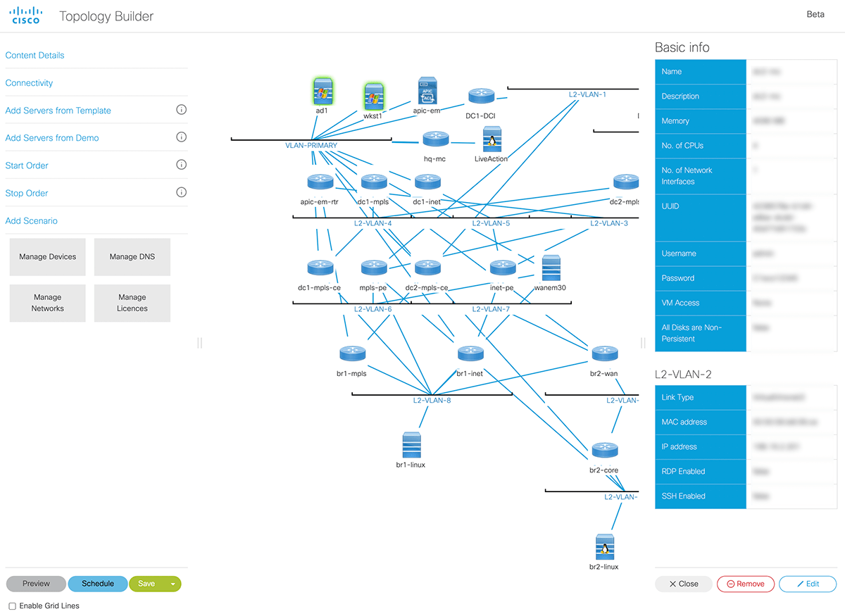
Topology Builder
Replacing 20–80 hour hardware builds with 15-minute self-service demo creation — now how Cisco's entire global sales force runs live demos.
- Role
- Sole designer and design lead across product vision, discovery research, prioritisation, UX architecture, interaction and visual design, accessibility and validation
- Team
- Product Owner, engineering squad, senior Sales Org stakeholders
- Scope
- End-to-end redesign of a global demo platform — driving adoption of virtual environments over physical kit
The business problem
Cisco Sales Engineers rely on live demos to close enterprise deals — and those demos traditionally ran on physical hardware shipped to a location, racked and configured per customer. Each environment cost $10,000–$50,000 and 20–80 hours to build.
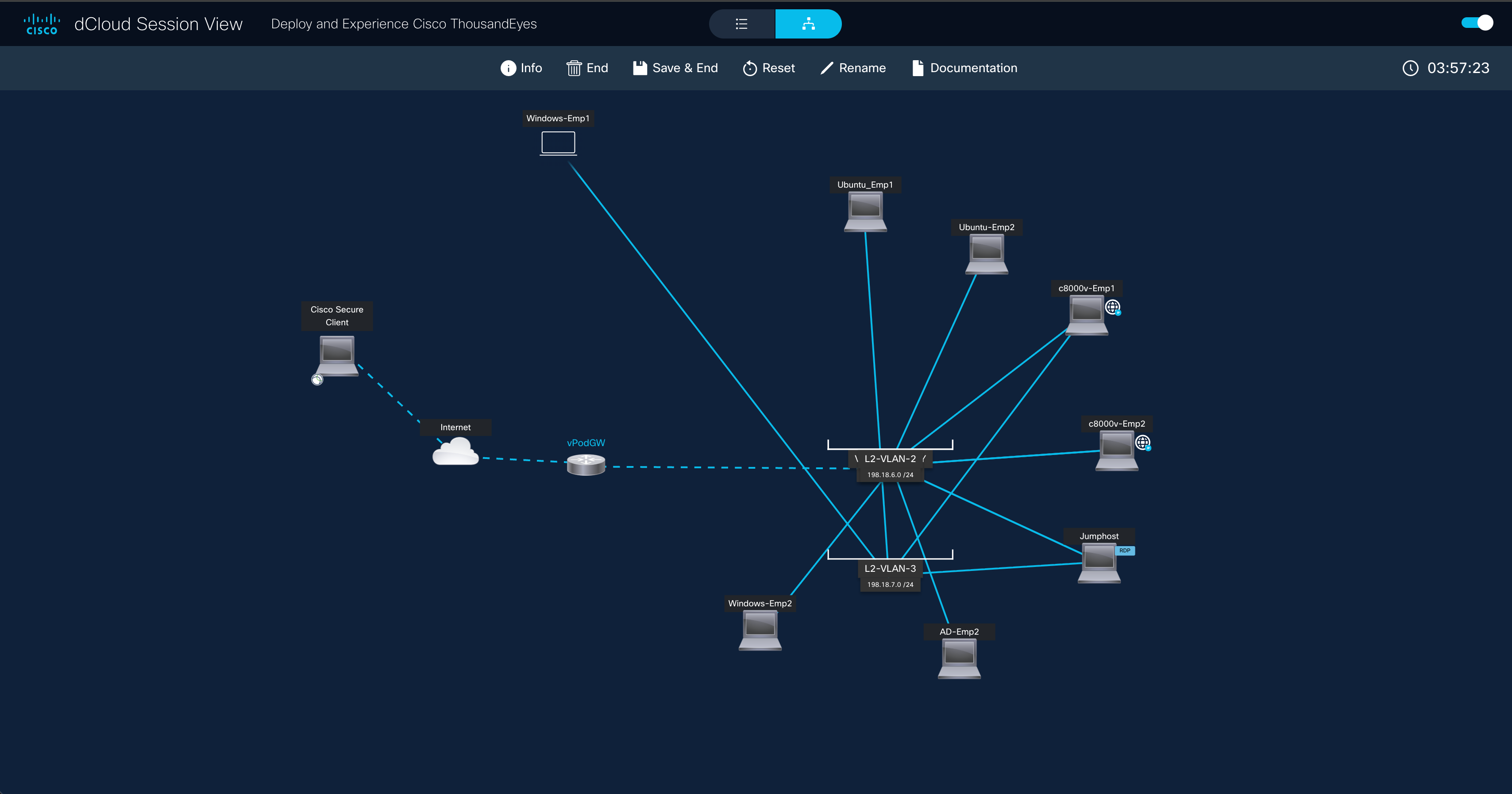
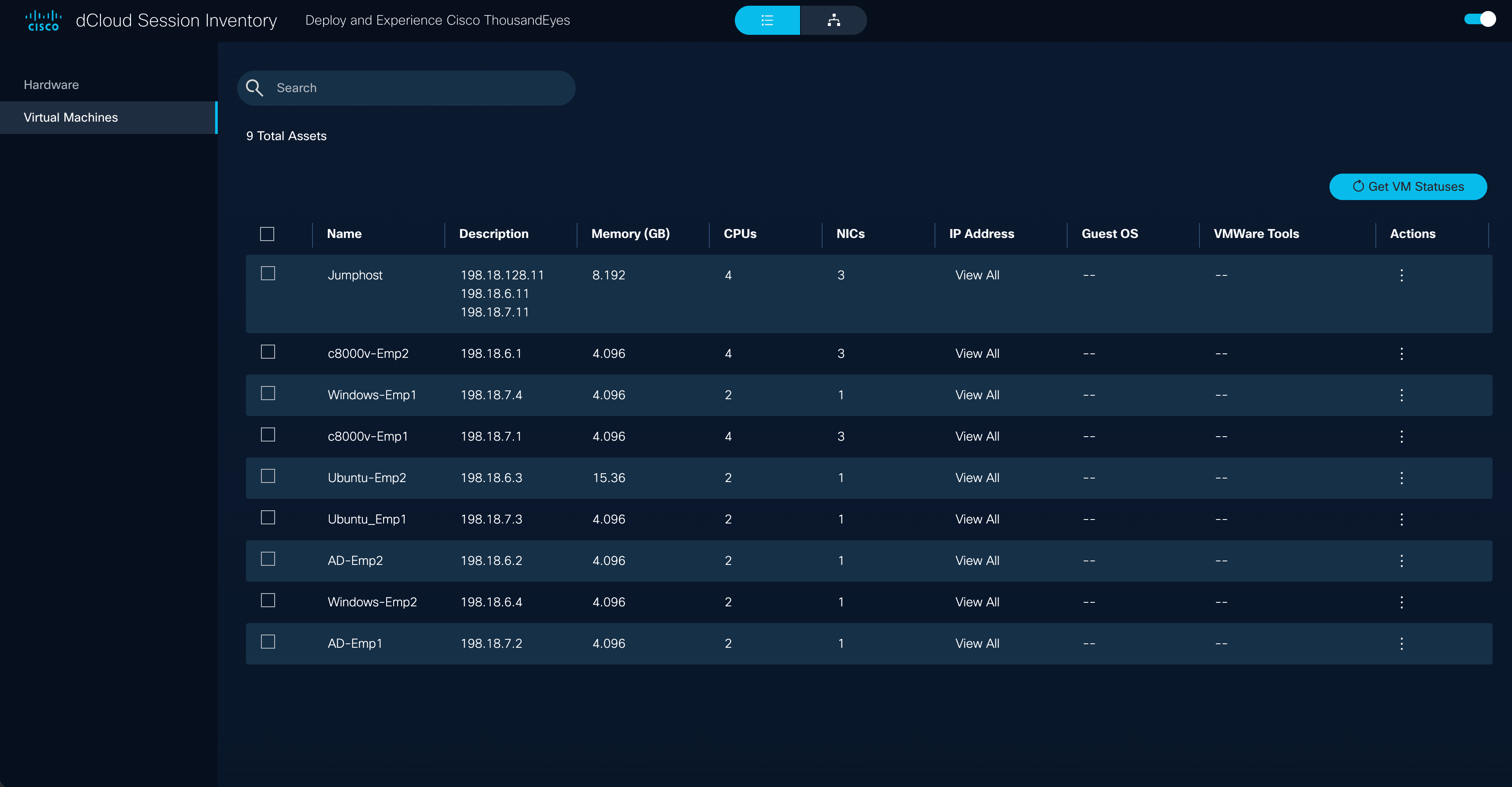
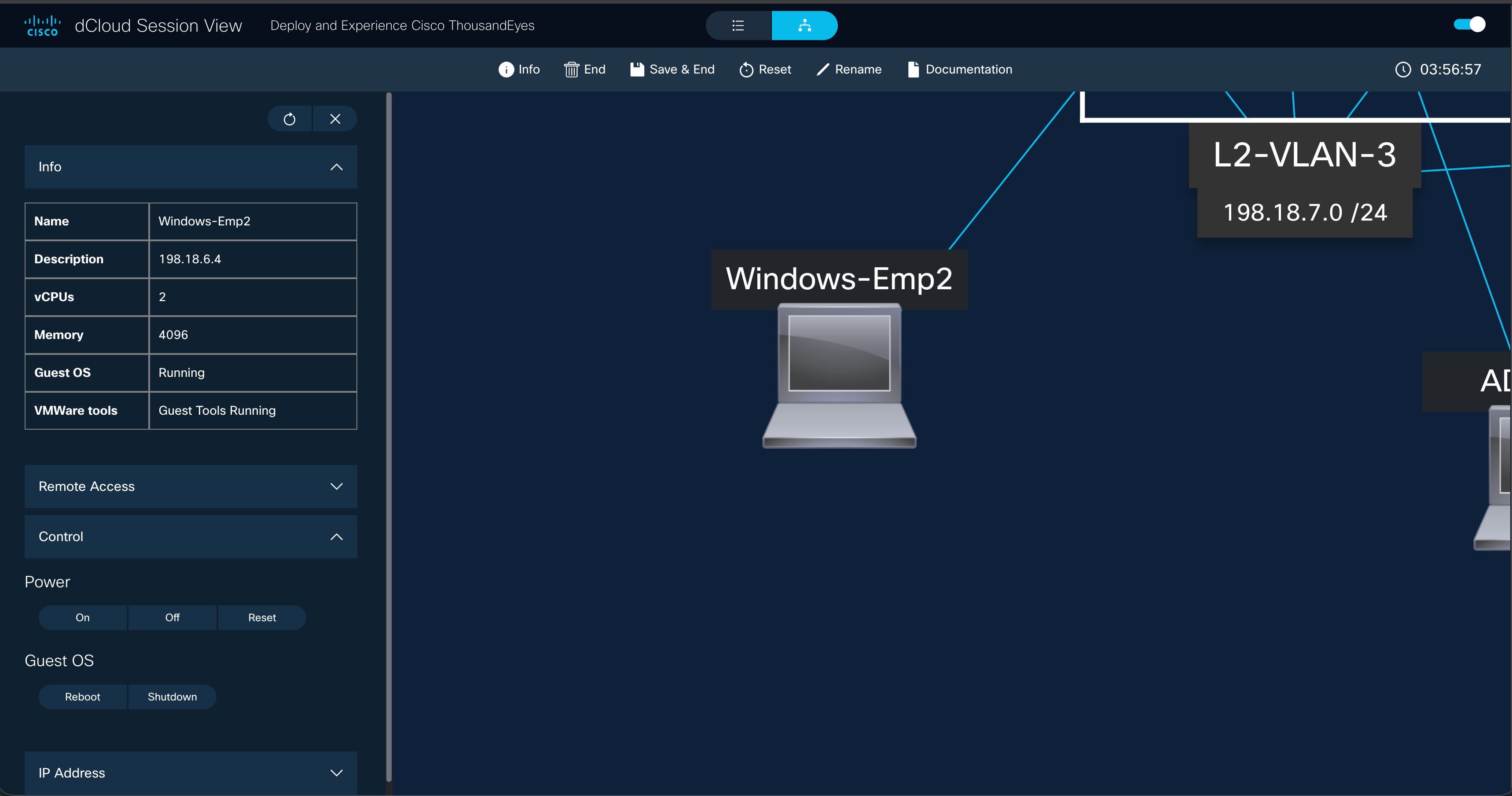
Topology Builder — part of Cisco's dCloud platform — was the bet to change that, letting SEs build virtual environments instead. I led the end-to-end redesign, including a new Session View that made it the front door to all dCloud activity, not just a building tool.
The blocker was adoption. The tool had been built with no design input, and SEs were falling back on physical kit because creating environments was too slow to trust under pressure. The mandate was to make virtual demos the default, not the exception.
Discovery
Before touching the interface, I ran 10+ remote interviews with Sales Engineers across global regions and a survey — 100+ responses within days. Three issues kept surfacing:
Configuration crammed into the diagram workspace.
Engineers made avoidable errors they couldn't see — the single most-cited pain point.
Colour-only communication in the topology.
8% of male respondents reported colour blindness — a meaningful slice of a 10,000-person sales org who couldn't confidently read their own environments.
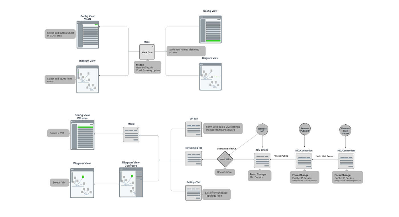
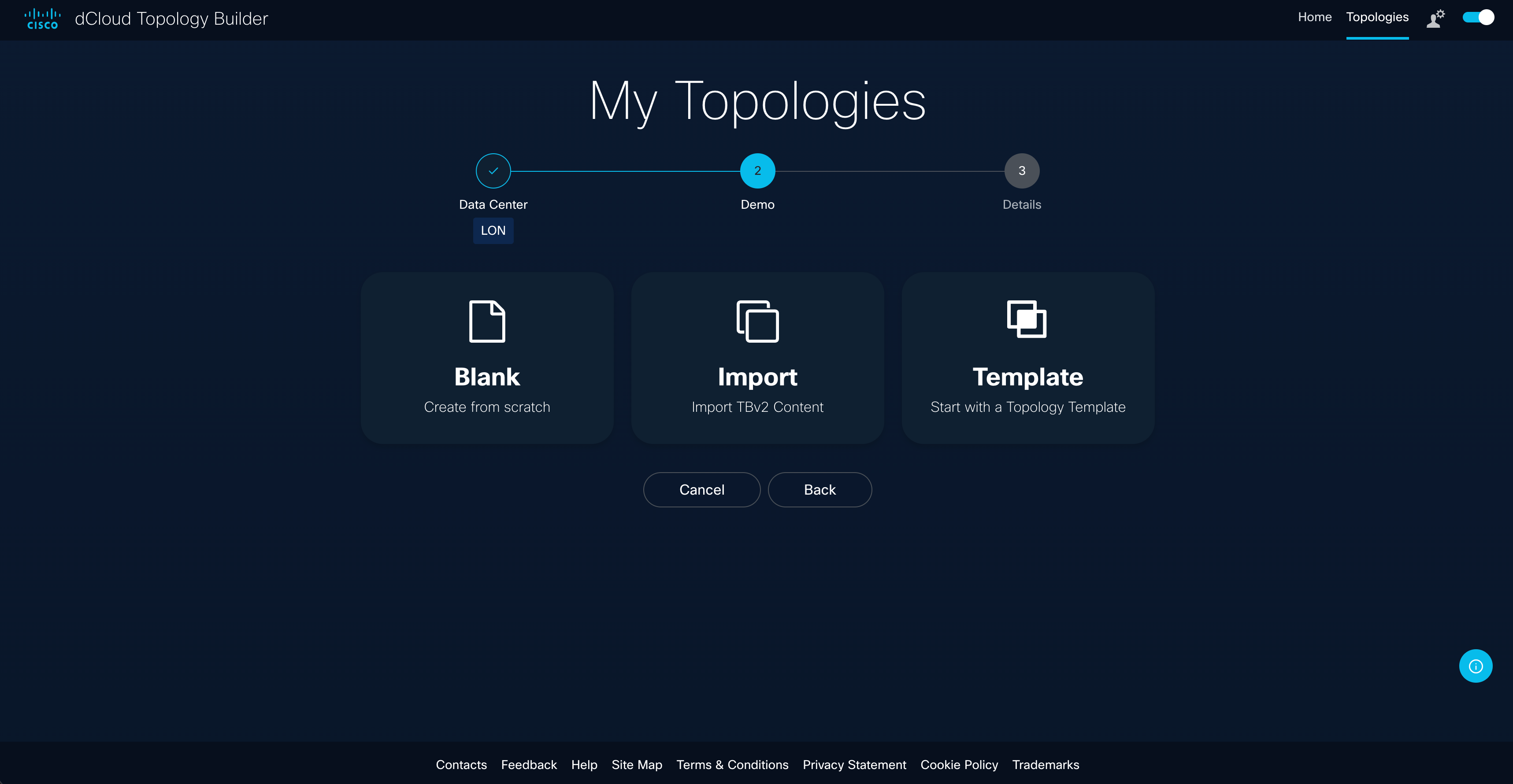
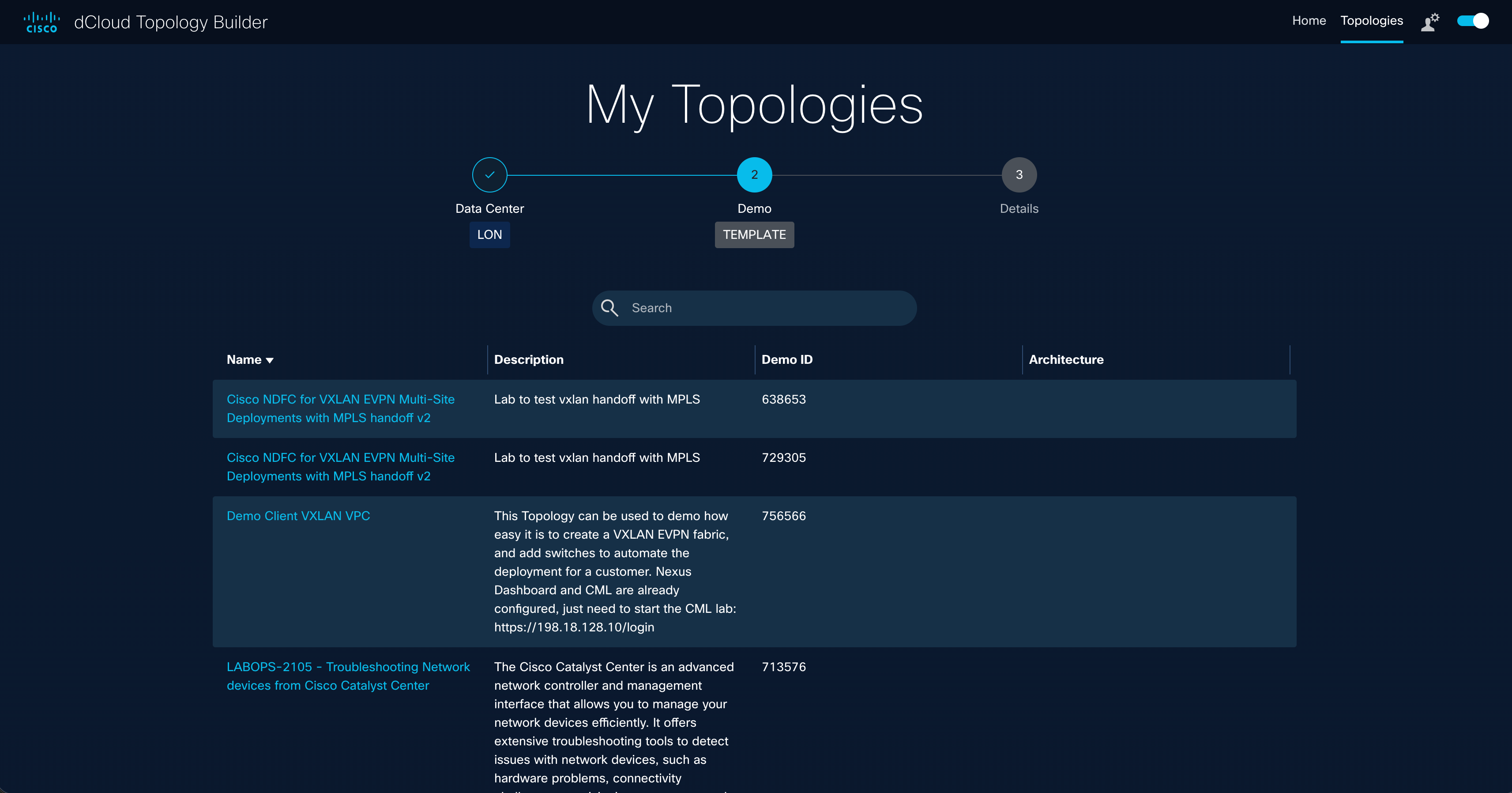
Every demo started from a blank canvas.
No templates, no duplication — and 82% asked for dark mode because eye strain was affecting accuracy on long builds.
Together they pointed to one root cause: creating a demo took too much effort to trust under pressure — and that effort was exactly what kept engineers reaching for physical kit.
Three strategic bets
Rather than build to the loudest voice, I triaged everything against one question: what most reduces the effort of creating a reliable demo?
- 1.
Config View — a dedicated workspace for editing configurations, separated from the diagram. Attacked the top adoption blocker directly.
- 2.
An accessible topology system — line styles alongside colour, so the diagram never relies on colour alone. A sales tool 8% of the salesforce can't read is a business problem.
- 3.
The Wizard and templates — guided setup and duplication, killing the blank-canvas start that burned the most time.
Advanced sharing and additional integrations were genuine requests — but they'd have delayed the MVP without improving the core workflow. I held the line on scope, and both later shipped in better form once the foundation was right.
Decisions worth examining
Config View: separation over compression. Engineers under pressure need fewer things on screen, not smaller ones. The dual-view model gave configuration its own full canvas while keeping the diagram one click away — validated through two rounds of usability testing.
PDF export for customers. SEs can export the topology diagram directly, giving customers a leave-behind that documents the architecture built specifically for them. Small feature, outsized value in a sales conversation.
Accessibility: tested with the people it was for. I introduced line-style differentiation alongside colour, added a diagram key, then validated with colour-blind participants directly — who reported a marked improvement. Designing for affected users and testing with them are different things; this project needed both.
Iterate, then iterate again
Usability testing ran in two rounds. The key finding: even after the first Wizard iteration, demo creation still felt cumbersome. Template duplication — start from a proven base instead of assembling from parts — was the fix, driving setup time down by up to 50%.
I treated adoption as part of the design problem: a video tutorial hub and full user guide shipped alongside the product, not after it. The dark mode 82% of engineers asked for shipped as reusable components on the Sales Org UI Kit — since adopted across other products on the platform.
Impact
70,000+ users per year, 180,000+ sessions per quarter
extended to Cisco Preferred Partners through the Cisco 360 program and launched at Cisco Impact, Las Vegas as a flagship product.
Demo creation time cut by up to 50%
20–80 hour physical lab builds replaced by a 15-minute on-demand launch, eliminating $10,000–$50,000 per-environment hardware costs.
I wrote the script and recorded the voiceover
for the Cisco 360 partner rollout video — the voice 300,000+ Cisco partner companies heard introducing the product.
“Enabling SEs to create their demo in an entirely self-service environment is a game-changer for our team and the entire technical sales community.”
Looking back
What I'd do differently: Instrument from day one. We proved the 50% improvement through testing, but live telemetry would have shown exactly where time was being recovered — and made the commercial case even harder to argue with.
Where it led: My current work connects demo activity to Salesforce deal revenue — closing the loop this project opened, from "demos are faster" to "here's what demos are worth."
“Thank you for all you've done to innovate dCloud and reach the beta milestone with Topology Builder. Enabling SEs to create their demo in an entirely self-service environment is a game-changer for our team and the entire technical sales community. I look forward to seeing the great content that is produced, the business impact, and where you'll take demo capabilities next.”
“Thank you for your commitment to bringing Topology Builder and dCloud Expo to life for our Preferred Partners. These demo tools are transforming how our partners showcase our technology and are a testament to what we can accomplish together.”